
The London tube map you get at any tube station or guidebook looks something like this:
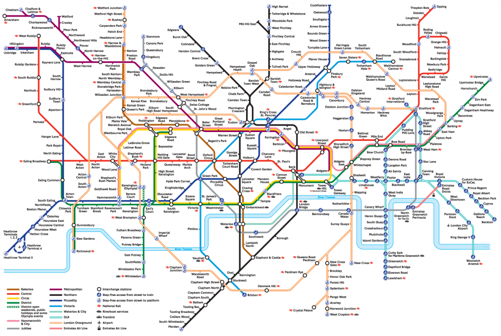
It’s fairly extensive, but it is a simplified reality. It does not show the actual geographic locations of stations or the lines, but rather their relative positions. This is one of the reasons many tourists make the mistake of riding the Piccadilly Line from Leicester Square to Covent Garden even though it is much faster to walk that distance.
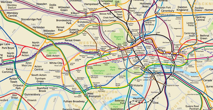
Central London is a lot less ‘square’ then the tube map indicates. A more geographical accurate map looks something like this:
However, the London tube map is a cultural icon. It shapes the London culture along with the Tube.
Organisations have their own cultures and subcultures as well as map. One of the dominant organisational maps is the organisational chart. Often a lot of neat rectangular boxes all exactly the same size, with lines connecting them. Each a specific levels to show hierarchy and so on. Just like the tourist riding the Piccadilly from Leicester Square to Covent Garden, it would be unsurprising if you expected each ‘box’ on the org chart to carry the same power and influence to another one at a similar level. However, anyone who has worked in or around any organisation, knows that not to be true.
Reality is a lot more messy. Even messier than the ‘real’ tube map is. And organisations are made up of people. And people evolve. Our influence ebbs and flows. So the ‘map’ is always changing. And the people in the map bring their own personalities, cultures, ways of working to their work. Some are very hierarchal, some are not. So not only is their relative power and influence different, so is their behaviour.
Paying attention to this is often overlooked in our desire to create change. We need to understand both the org chart and the ‘real’ org chart. But more importantly, at the beginning we need to find ‘people like us’. People with similar worldviews to us. People who will embrace the change we seek to create.
And then create a new map layer. One that overlays the ‘people like us’ on the other layers of org chart and power/influence org chart. By doing this, we see clusters of influence and ‘locations’ where the change may take root easiest.
0 Comments