Yesterday, I shared a couple images Daisy created to help visualise access and portability while we were creating the ABCs of Responsible Data book. Building on this, we can use visuals to help create awareness and understanding. Some good examples of this can be found in illustrating the encouragement manifesto. Not only is the manifesto itself lovely, but the illustrations bring it to life in a way the words cannot.
The Gaping Void does this time and time again (although weirdly, you wouldn’t get that from their homepage). They do such a brilliant job of visualising concepts, complexity, and ideas. You can see a few in These 20 Pictures Will Teach You More Than Reading 100 Books. One of the things I like about the their visualisations is the element of fun or play that is included. Visualising ideas, concepts, and complexity does not have to be boring. Do a google image search for ‘gapingvoid’ and let me know some of your favourites.
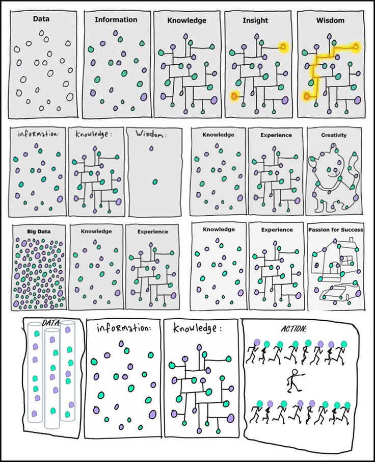
We see this in the below visualisation about data and information. Colour, cats, and cars are added to help bring it to life and to make you smile. And when we smile, we are more likely to engage and to tell others.

Visualisations do not have to be boring. It is good to be reminded of this when thinking about most forms of communication, but especially in our work on digital literacy and rights. What would a silent, but visual, Pechakucha presentation on digital literacy look like that was memorable. How could we make it remark-able?
And now over to you. What are you communicating this week? How can you use visuals to communicate your idea? What can you include this week?
Images by GapingVoid

0 Comments